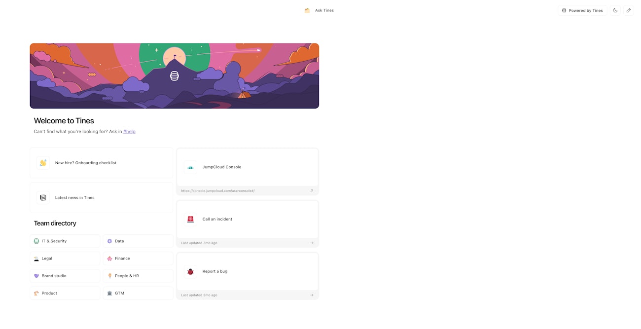
Collections are a customizable and shareable index of related pages, images, external links, and rich text. It allows users to discover pages for easy self-servicing.
Use the tenant dropdown to find all collections in your team.
The team-level view will show you the names, creation dates, update dates, and access control levels for collections in your team.
Controlling end-user access
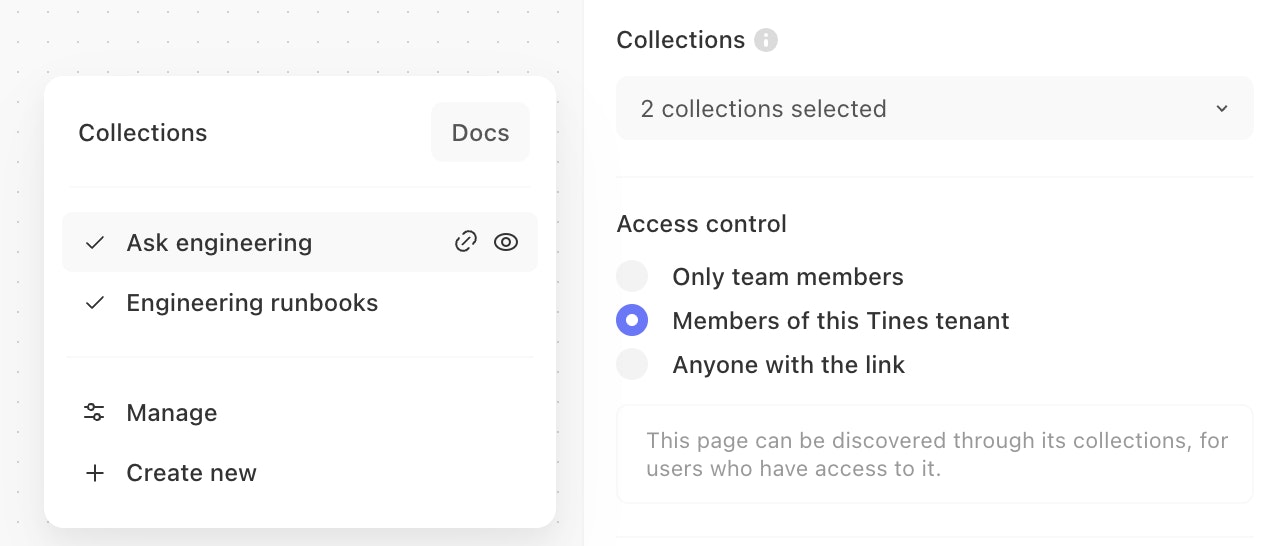
By default, collections can be accessed by users signed into your tenant. Use the button in the top right corner of the collection editor to control who can view your collection.
ℹ️Info
In total, there are three levels of access control that you can apply to each collection:
Only team members: only signed-in members of the team that the collection is in can load the collection
Members of this Tines tenant (default): anyone signed into the Tines tenant can load the collection (even if they’re not a member of the collection's own team).
Anyone with the link: anyone with knowledge of the collection URL can load the collection.
❗️Important
Editing a collection
The collection editor can be found from the story diagram, your team's home, or the collection itself. It is a separate page that allows you to change the emoji, rename a collection, add, reorder, resize, and remove elements in a collection.
Collection name and emoji
Your collection should have a unique name. It forms the URL so others can find it. For example, “Ask engineering” will be accessible at https://tenant.tines.com/collections/ask_engineering.
You can change a collection's name or emoji by clicking on them at the top of the collection editor.
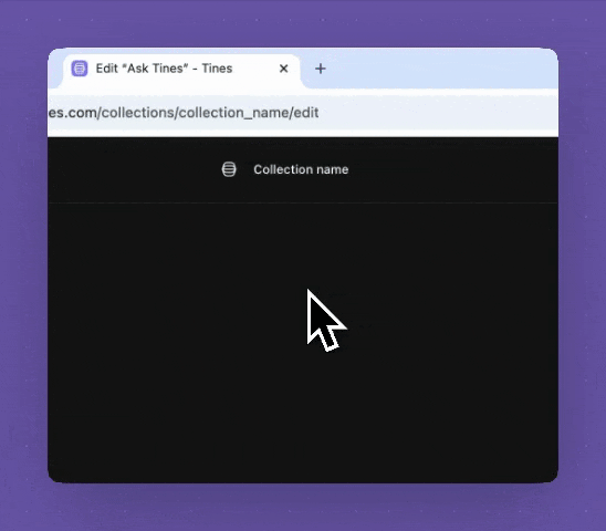
Be cautious: changing the name may affect bookmarks.
Adding and removing elements
Use the collection toolbar in the top left corner to add various elements to a collection.
Use the element toolbar below the selected element to configure the element or delete it.
Reordering and resizing elements
Collections allows you to drag and drop to reorder and place your elements anywhere within its grid system.
Use the drag handles on a selected element to resize it. Each element has a number of preset sizes.
Viewing a collection
Preview your collection layout by toggling between the desktop and mobile screen sizes.
Hit "View live" from the top right corner to view the live collection.
Selecting an element to configure it
There are additional and contextual configuration options for each element type. Select an element to see the available options in the element toolbar.
Collection elements
You can add a number of element types to a collection from the top left toolbar:
Pages
Add a page element and use the element toolbar to select which page is displayed in the collection.
Only pages that kick off a workflow can be added to a collection. These pages have a static URL and can be accessed at any time.
Pages in a draft or draft stories cannot be added to collections as they are only available as you work on them.
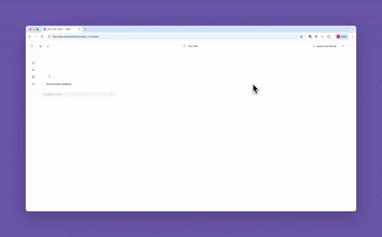
A page can be added to many collections. For example, a page that lets users submit feedback can be discovered from both internal and external collections.
🪄Tip
Changing a page emoji
Pages optionally have an emoji that is displayed in collections or case actions. If a page isn't behind change control, you'll be able to change it from the element toolbar.
Open the selected page in a new tab
Use the "Open page" button to view the page in a new tab. Useful to remind yourself what a page is for.
Configuring query strings
Power users may want to prefill some page fields with query strings. With this option, the query string will be propagated to pages loaded inline in a collection.
Always open pages in a new tab
By default, pages are loaded inline in a collection. There is an option to always open pages in a new tab in the more menu on the top right of the collection editor.
Add pages to a collection from the story diagram
You can manage collections by selecting a page from the diagram, then navigating to the Collections section on the right panel. Here, you can add or remove the selected page from your collections.
You can also view the collection or copy its link for easy sharing from this section.
External links
Add related documentation, tools, or resources living outside of Tines into a collection via the external link element. This lowers context switching for your entire team.
Configurations
Every external link element will attempt to fetch the favicon of the target website. It is also possible to change the icon to product logos, Tines icons, emojis, and custom icons via the icon picker.
Optionally, update the description from the element toolbar to provide more context.
You can view the link in a new tab via the element toolbar to confirm your selection.
Images
Add pictures and diagrams to your collection via the image element. Upload your image by dragging it over the element, clicking "browse" on the element, or "Replace image" in the element toolbar. JPEG, JPG, PNG, and SVGs are supported at this time.
You can change the image sizing via the element toolbar. There are three options:
Fill: stretches the image across the entire element
Contain: contains the image within the element while maintaining its aspect ratio
Cover (default): size and clip the image to ensure it spans the entire element while maintaining its aspect ratio
These options corresponds to the object-fit CSS property.
Rich text
The rich text element is a WYSIWYG editor that allows you to preview markdown as you write it. Use this element to give your visitors more info about the collection.
The / command brings up all possible markdown block types for easy addition, including simple paragraphs, lists, code blocks, tables, callouts, and more.
Highlighting any text brings up a toolbar to change your block type, font type, or font color.
Make your rich text element more prominent by changing the background color via the element toolbar.
This element type grows as you type but allows you to resize it via the drag handlers like all other elements.