Dashboards
Introduction
Dashboards offer a place to visualize data from records or cases in a single view. These views help you monitor what's happening across workflows within your team.
Components
There are three types of components on the dashboard:
Charts: created from your records data to visualize records with applied filters in multiple chart types for an aggregate view
Case Views: filtered view of cases or case summary data (i.e. MTTR, MTTA)
Notes: context to provide alongside the charts or lists with Markdown support
Configuring dashboards
Create a dashboard
Click New Dashboard
Name the dashboard (this must be unique and can be edited at any time)
Start from a template
Tines Stories includes sample dashboard templates to help you get started quickly.
On the Dashboards page, open the help panel on the right-hand side (it opens automatically for teams with no dashboards).
In the Templates section, click Start with template on the one you want.
Tines Stories creates a new dashboard from the template and opens it, ready for you to rename or edit.
Note: Importing a template requires dashboards enabled on your tenant and permission to create dashboards (Team admin, Editor, Case manager, or Dashboard manager).
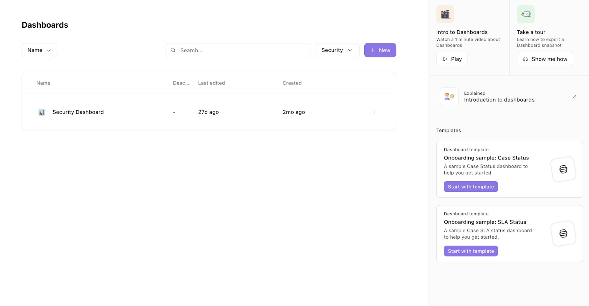
Dashboard templates (in the right hand panel)
Add a note to the dashboard
Notes let you add explanations and context to your dashboard
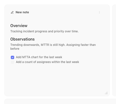
Dashboard Note
Add a Case view to the dashboard
Case views allow you to create some basic charts based on a saved case view or a new search. To create a case view, follow these steps.
Add a new Case view element to the dashboard
Name the element
Choose to use a saved cases view or use the search filters to query for the data you want
Select the display option for how you want to visualise the results
MTTR & MTTA Case views
Case views include the option to display and graph MTTR (mean time to resolve) & MTTA (mean time to assign) values for cases within a team.
The time to resolve value for a case is calculated by the difference between the timestamps of when a case was opened (created_at) and when it is closed (resolved_at). Similarly, the time to assign value for a case is calculated by the difference between the time the case was opened (created_at) and a user first being assigned to the case (created_at on the first user assigned activity record).
Add a Records chart visualization to the dashboard
You can also add Records graphs into your dashboard to add visualizations of data captured via Records
Dashboard snapshots
Snapshots let you email a copy of a dashboard on a schedule — useful for recurring reports to stakeholders who don't log in to Tines Stories. Pick who receives it, how often, and which charts to include.
Create a snapshot
Open the dashboard and click Snapshots in the toolbar. (The dashboard must not be in edit mode — publish or discard any draft first.)
Select Create new snapshot.
Give the snapshot a name (for example, "Weekly dashboard report").
Add one or more recipient email addresses.
Choose the frequency (for example, every Monday, or every day) and the timezone. The next scheduled send times are shown so you can confirm them.
Choose which charts to include or hide.
Save. Use the active toggle to enable or disable the snapshot at any time.
A dashboard can have multiple snapshots (for example, a daily summary and a weekly report), each with its own recipients and schedule.
Note: Managing snapshots requires permission to manage dashboards (Team admin, Editor, Case manager, or Dashboard manager). Charts that can't be exported are excluded automatically — if every element is hidden or non-exportable, the snapshot has nothing to send.
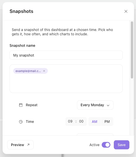
Dashboard snapshot modal